Web Optimization
How To Optimize Images for Websites
Best Way to Add and Optimize Images to Your Website.
And deep down you know it’s important too. Selecting the right images leads to better visual appearance and engagement on your website. It also leads in conveying information more effectively and help strengthen or build your brand
You may be confronted with several questions:
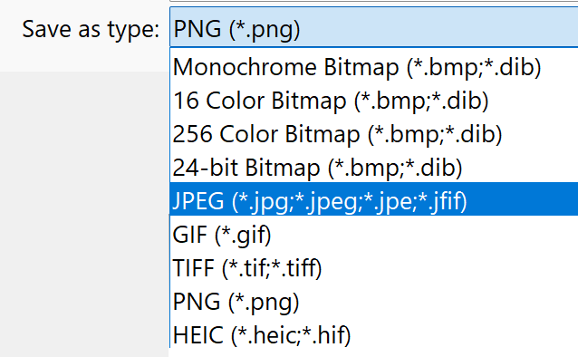
Q: What file type should I use for images? .jpg, .svg, .png, .webp, .jpeg (didn’t I just mention that?), and that weird one that iPhone use for some reason?
Q: I uploaded my photo but it’s taking forever to load on my page?
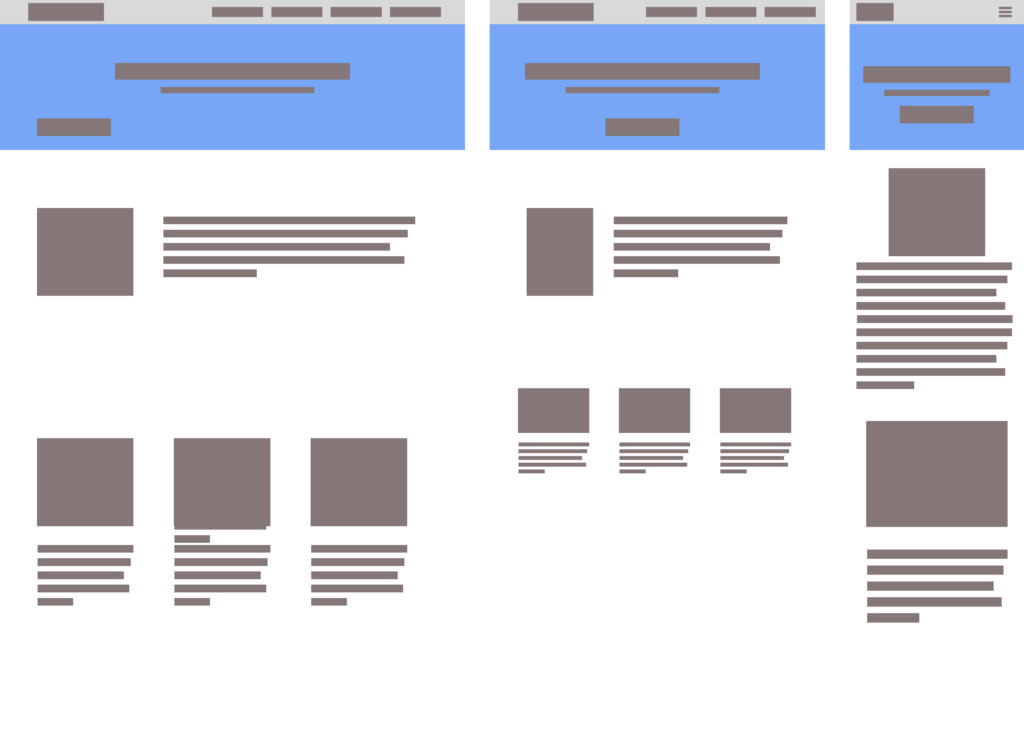
Q: Why is my image blurry or stretched (or both!!)?
Q: Where can I find a photo that isn’t copyrighted?
If you have struggled with any of those questions, then I feel your pain. I’ve been there. This article will hopefully help answer some of these questions and more.
JPG vs JPEG vs PNG vs SVG vs WebP. I’m so confused…
Developing a striking and relevant website requires many things, but none more important than images.
There are many formats for websites but the most important three are JPEG, SVG and PNG.
As a web developer I use these formats for the following purposes:
JPEG (or JPG): for images
SVG: for icons, shapes, or dividers
PNG: for logos, icons, and anything requiring transparency
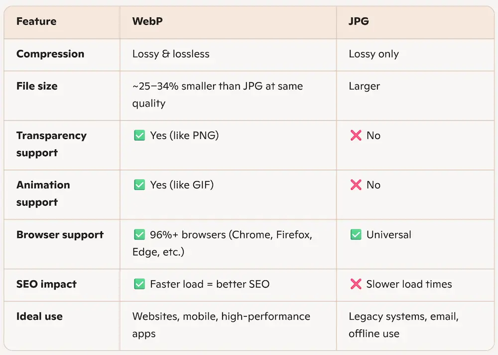
*WebP: This is new and is a modern image format developed by Google that delivers significantly smaller file sizes than JPG—often 25–34% smaller—without sacrificing visual quality.
JPEG vs JPG what is the difference?
For most of us, they are essentially the same thing. If someone says JPG (pronounced Jay Pee Gee) or JPEG (pronounced Jay Peg) they are essentially saying the same thing. I’m sure there will be some in the comment section pointing out why this is SOOO wrong, but there has never been a single experience in my time as a web developer where one was preferred over the other. They are the same. Period.
Personally, I like JPEG because it is more fun to say “Jay Peg”. Almost sounds like a bird.
Why would I use a JPEG?
For almost every image I use online I immediately default to JPEG. This is perfect for pixels and clarity and can be optimized to reduce size while not reducing image quality.
Why would I use a WebP for my website?
Using WebP instead of JPG offers a range of performance and workflow benefits for modern websites. WebP images load faster thanks to smaller file sizes, which improves mobile responsiveness and boosts Core Web Vitals—key metrics Google uses to rank sites. This format also reduces bandwidth usage, making it ideal for hosting plans with limits. Unlike JPG, WebP supports transparency and animation, allowing it to replace both PNG and GIF in a single format. Plus, it integrates smoothly with tools like Photoshop, WordPress, and Elementor, streamlining image optimization across your entire workflow
Where Can I Find JPEG or WebP images for my Website?
I love using stock images for web resources. Especially when I need something standard almost as a place holder. For this I use Unsplash
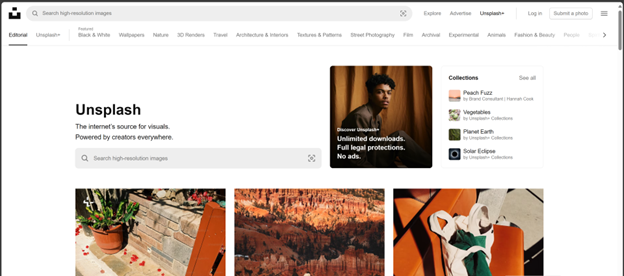
Personally, I use Unsplash for almost all my projects. Especially if you need some placeholder images or just something to help set the vibe. Unsplash really is the gold standard.
But wait! Theres more! If you are looking for other examples of online image galleries, you can try one of these
- Pexels: claims to be the best free stock photos, royalty free images & videos shared by creators online. It has a similar experience to Unsplash and has over a million high-quality images, and you can download them without signing up. Pexels also provides browser extensions and plugins for easy access.
- Pixabay: makes a similar claim to Pexels as “Stunning royalty-free images & royalty-free stock”. They offer over 4.4 million+ high quality stock images, videos and music shared by our talented community. Like Unsplash, it allows direct downloads without registration.
- Openverse: is an open-source alternative to Unsplash and part of the WordPress Project. It has “more than 700 million creative works” and offers the Creative Commons Licence for all its images which means you can confidently post their content on your website without fear of lawyers *(read the fine print of course).
- Wikimedia Commons: If you are familiar with Wikipedia, then this will feel very familiar. It offeres a vast repository of freely usable media files, including images, audio, and video. It’s a valuable resource for educational and creative projects.
- Freepik: While Freepik offers more than just photos (including vectors and illustrations), it’s a great source for visual content. It also offers templates and paid content. Im not very familiar with it, but its another resource that might be helpful.
Zoinks! Those Images Are Really Large! Are They Too Big For My Website?!
Yes and yes. Next question?
Jk. Yes many of the images you download from Unsplash or one of their competitors are by design massive images. They are intentionally large because they are meant to highlight the photographer or designers image as the absolute highest quality. Some of these images can be 20 or more megabytes (mb). While beautiful, they are horrible for SEO and your website will crawl like it’s the 1990’s and you are on that 65k dialup modem (remember the noises?).
You will ABSOLUTELY NEED TO OPTIMIZE IMAGES.
Yes, I am yelling and it’s for your own good. Setting out to optimize images sounds complicated but it is not. There are many online resources that are incredibly easy to use and even offer options to tweak the quality.
A good rule to live by when optimizing images is keep all image sizes as small as possible
- body images around 200-350 kilobytes (KB)
- Header/Hero Images between 700-900 KB
- Depending on heigh of image and if it goes full screen left to right.
* For reference, 1000 kb is equivalent to 1 mb.
The problem you will need to accept is image quality. The image quality will go down but there are a few tricks you can use to avoid this:
- Choose images that do not need to convey a lot of detail. While beach sunsets are beautiful you don’t necessarily need to see every H2O molecule in the waves.
- Add an overlay: you can layer a color over your photo and set the opacity to go from 0 to 1 (see-through to solid color). This can reduce the detail enough to not worry about image quality.
- Fyi it is crucial to add an overlay if you are using text over the image. Its all about ADA and readability.
- Use an image optimizer: There are many out there and some page builders have built in image optimization tools like Wix, Squarespace and WordPress, but it is always helpful to optimize first. (see paragraph below).
- Actually, reduce the size of the image: if you know the image is going to be relatively small in the body of your paragraph around 500px wide then don’t use a photo that is 4500px and optimize it down. (see paragraph below).
What Tools Should I Use to Optimize Images?
There are so many out there but I personally use three almost every single day.
Squoosh.app
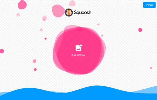
One of my favorite tech company names of all time. It’s the perfect name. And you just cant help saying it “Squuooooooosh”.
I use this product constantly. All you do is drag and drop. Makes optimizing images almost too easy.
Adobe Photoshop
HERE ARE THE STEPS:
Once you open your image in photoshop go to the top bar and select Image
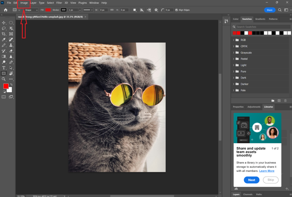
You will need to adjust the image size here by selecting Image then “Image Size” which will then show the current size of the image.
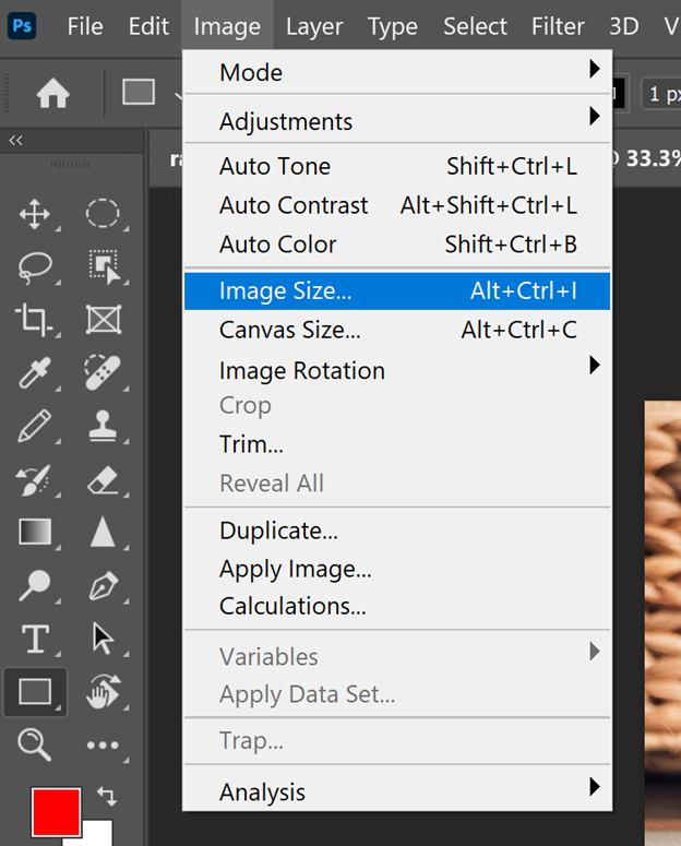
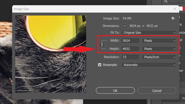
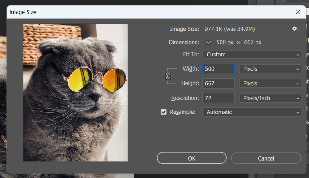
You might notice the image zoomed out a bit. You might also notice the image size is smaller. This can sometimes take an image that is 1-3 megabytes down to a 100-500 kilobytes just by changing the size. If you are using image optimizing software on your WordPress or other CMS platform it will perform much better if you do this simple step first.
Next step, Export.
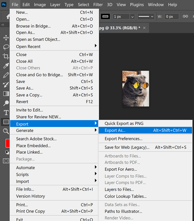
Before clicking export you can change the format (I don’t ever), or adjust the quality (I typically don’t), but the preset options made the image even smaller! Now its 183.9 KB! What a savings!
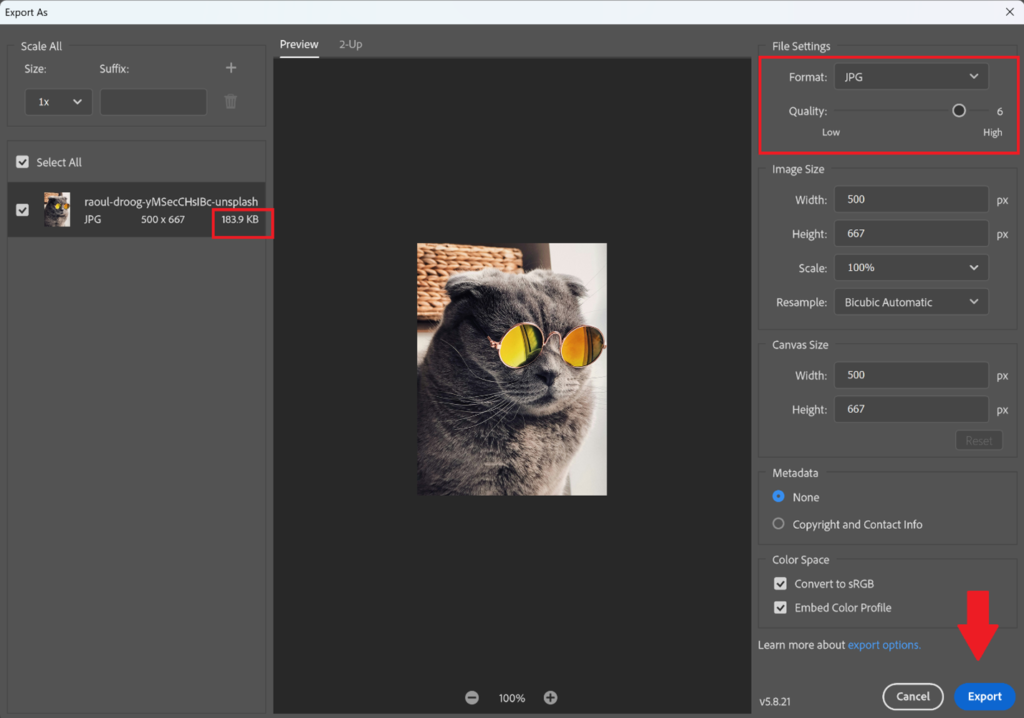
Adobe Photoshop saves optimized images in special folders which might make it difficult to find, so make sure you save it to the right folder first.
Exporting for WebP Format in Adobe Photoshop
Adobe Photoshop now fully supports the WebP image format, allowing designers to export directly to .webp without needing any plugins or workarounds. Starting with version 23.2, Photoshop users can open, edit, and save WebP files using the “Save a Copy” or “Export As” options, making it easy to take advantage of WebP’s smaller file sizes, transparency support, and web-optimized performance. This native integration streamlines image workflows for modern websites and ensures compatibility with platforms like WordPress and Elementor.
Figma
Not everyone has access to Adobe Photoshop. It is a software that is very complicated, requires a monthly subscription, and is primarily used by graphic designers, photographers, and other professional creatives. If you do not want to use Photoshop, I highly recommend Figma.
Figma is a free design platform that mirrors Adobe Photoshop and Adobe Illustrator, but is primary used for designing web-based layouts, prototyping, and almost any other creative application you can think of. Below are the similar steps to shrink large images down.
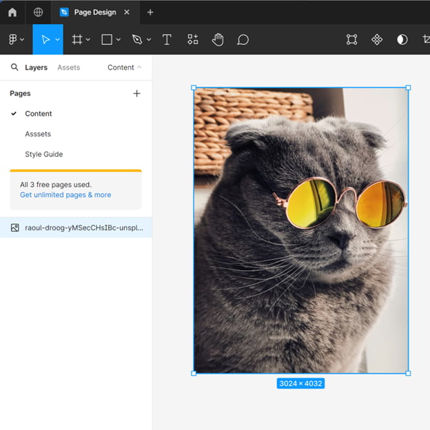
Once you have Figma open simply place an Image anywhere on the board. To shrink images, you don’t need to worry about creating anythink like frames, groups or components.
To place an image:
Open a new Figma project and place the image
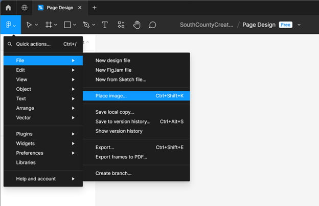
Once your image is placed you can adjust the size by clicking on the image then changing the width or height in the sidebar on the top right
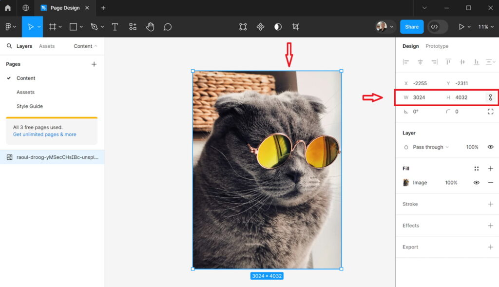
Change the width to 500 (just like we did in Adobe Photoshop). The height should automatically adjust with it. If it doesn’t then click the little link icon to the right of the W: and H:
Now Export. You can change the Filetype to JPG (that’s what I would do). PNG is fine too. Click the Export (your filename) then save.
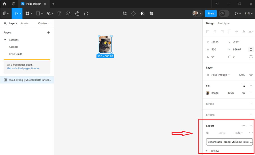
You can tell it worked because the image shrunk on the canvas.
You may notice the file size is larger. In this case almost 3x the size as Photoshop. This is because Photoshop exported at a reduced quality (set at 6) this is fine and when we optimize it will really not be much different
Does Figma Allow WebP format Exports?
Unlike Photoshop, Figma does not support exporting images in the WebP format, which often surprises designers who rely on it for web‑optimized workflows. Figma’s export options are limited to PNG, JPG, and SVG, meaning you’ll need an external tool or converter if you want to take advantage of WebP’s smaller file sizes and faster load times. While this isn’t a deal‑breaker, it does add an extra step to the process for teams focused on performance and SEO. Many designers export assets from Figma as PNG or JPG and then convert them to WebP using tools like Squoosh, WebP Converter, or their build pipeline.
Still confused with how to optimize images? Schedule a quick chat with us. Its free!
Optimize your images
Now its time to SQUOOOOOOOOOSH
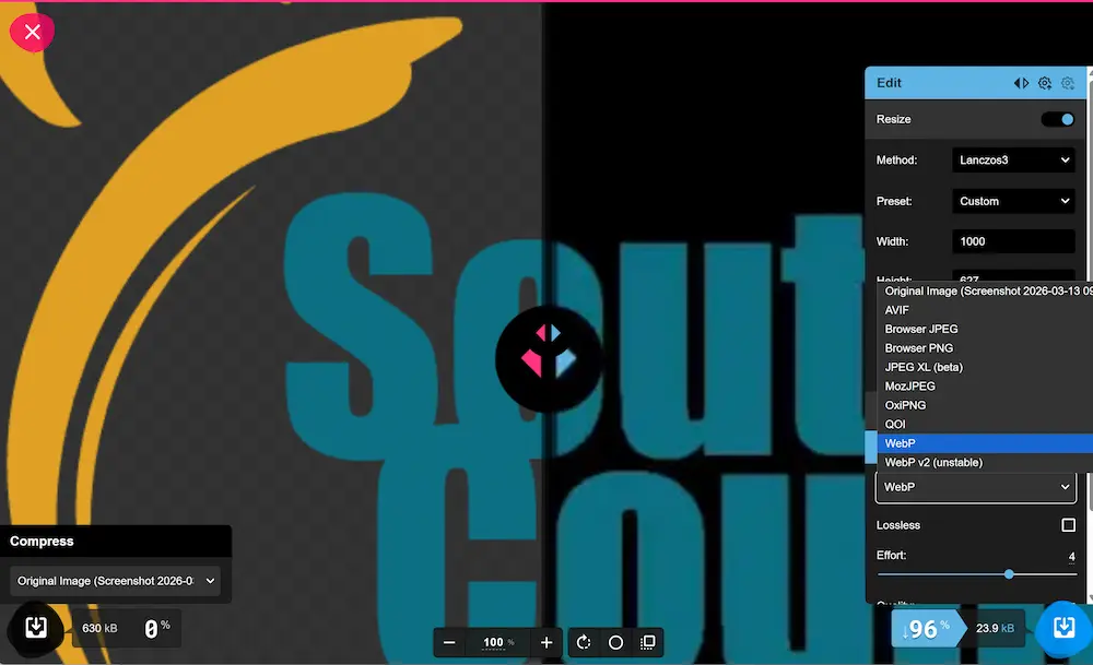
Once you drop your photo into the homepage you have options to adjust the settings even more. The left side is the original image (pre optimized straight from Adobe Photoshop) and the right is the optimized quality. You can slide the vertical bar left and right to see the difference and in the bottom right corner you can change the quality. 75% is good, sometimes if I’m feeling sassy I’ll kick it up to 90% (as a treat).

The new compressed format is MozJPEG (no relation to Morrissey) which works just fine online. I have never had an issue with it.
Notice the file size too. Its 64.5 KB and looks perfect. Original image from Unsplash was 3.02 MB (equivalent to 3,169KB) and now is 64.5KB. I’m no math wizard but that’s close to a 97.965% reduction in size! Prrfect for the web!
Using Squoosh to Optimize your image
Squoosh also allows you to resize and optimize images. This might be the simplest way to resize your image, however It doesn’t have all the bells and whistles available in Figma and Photoshop. Basically, just one bell and one whistle.
To resize simply drop your full-size image in, click Resize, Adjust Quality and Download. The reason I do not Use this to resize is it pixilates dramatically and is really difficult to adjust for quality. But it’s simple and gets the job done
You can now add this to your website!
Thanks for sticking for sticking around!
South County Creative is a digital agency specializing in consulting, websites, branding, and developing digital strategies for small businesses, museums, nonprofits, and educational orgs.
For more information you can read about image optimization by Foreground on How to optimize images for website performance: best image sizes, compression, tools & testing (updated for 2023) or this article from Bluehost Best Image Size for Websites – Everything You Need to Know!
Interested in having a professional for help to optimize images for your company? Reach out to one of the specialists at South County Creative
