
How to Make Your Website Look Less “Blocky”
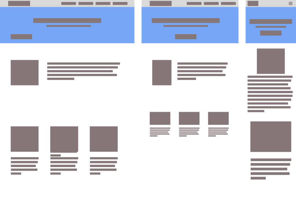
Web Design How to Make Your Website Look Less “Blocky” Julian Miller Creative Director – South County Creative How to Make Your Website Look Less “Blocky” Building a website on a platform like WordPress, Wix, or Shopify makes the process a breeze. You can quickly drag and drop content and get a website up in no time. But one of the drawbacks is a lot of the time the content looks very “blocky”. Almost like you are given a bunch of Lego pieces and asked to make a house with them. Creating a modern, sleek, and visually appealing website on one of these Content Management Systems (CMS) involves several key strategies to avoid that blocky and outdated look that can sometimes plague websites. Basic wireframe layout for a website Step 1: Choose a Contemporary Theme Whatever CMS platform you choose, you will have many options for themes. A theme is basically the colors, fonts, layouts, animations, and general look-and-feel of the webpage. One of the best parts about picking a theme is all you have to do is replace their stock content with your own. Many times you can get away with keeping the same layout and flow. Most popular themes in WordPress There is a drawback however. If you want to add additional content or sections to the page that didn’t come stock with your chosen theme. You will need to add the content understanding the overall flow and style of the website. This is where the blocky nature of homemade websites begins. When adding content to a theme that doesn’t already exist, CMS platforms like WordPress, Wix, Shopify or literally any other drag-and-drop website platforms offer “blocks” to include. These blocks are pre-built and pre-styled components that you just plop in wherever you like. This freedom can impact the design and look forced and many amateur web designers will add background colors, not enough padding or margins between block elements which interrupt the design and begin to feel blocky. Step 2: Choose Your Plugins All web building platforms offer plugins. Depending on which platform you choose you will have a number of free and premium options. Some free options may entice you to purchase their “pro” version offering which opens up many new options for your website. Using WordPress as an examples, page builders like Elementor, Beaver Builder, and Divi are very popular plugins that allow you to create custom layouts with drag-and-drop functionality, giving you more control over the design of your website. These are literally referred to as “Block Builders”! See how they encourage this Blocky behavior!?!? These tools offer a wide range of design elements, such as columns, sliders, and galleries, which can help you create a more dynamic and visually appealing layout. By using a page builder, you can avoid the rigid, blocky appearance that can result from using default WordPress layouts by offering many ways to stylize your additions. Again, the goal is to avoid thinking about each one of these blocks as independent of the overall theme of your website. There are many other types of plugins like ones for security, image optimization, and backups, but the ones we are focused on are block element related. Step 3: Image Selection Another important aspect of avoiding the “blocky look” and that dreaded 90’s dialup website look is by the use of high-quality images and graphics. Visual content plays a crucial role in making a website look professional and engaging. Invest in high-resolution images and consider using stock photo websites like Unsplash, Pexels, or Shutterstock. Additionally, incorporating custom graphics and icons can add a unique touch to your site. Tools like Canva and Adobe Spark can help you create visually appealing graphics that align with your brand’s aesthetic. We go into a deep dive to this topic of image selection and image optimization in this article How to Optimize your Images. Step 4: Typography Also known as fonts, typography also plays a significant role in the overall look and feel of your website. Choosing modern, clean fonts can make a big difference in how your content is perceived. Google Fonts offers a wide selection of free fonts that you can easily integrate into your website. Some of the more popular fonts used today are: Inter, DM Sans, Roboto, Raleway, Open Sans, and Poppins. Google Fonts Stick to a limited number of fonts to maintain a cohesive look, and ensure that your text is easy to read by using appropriate font sizes and line spacing. Consistent and thoughtful typography can greatly enhance the visual appeal of your website. Best practice is to pick a font style for your headers (H1-H6) or display text and another one for the body, accent, and sub header text. Websites like Pair and Compare, Font Fabric and Font Comparer allow you to place two or more fonts next to each other and see how they look. Sometimes you can find the perfect match this way. Step 5: Whitespace One of my favorite topics is how to incorporate whitespace (or negative space) effectively. This is in my opinion one of the best key strategies to utilize to avoid a cluttered and outdated appearance. Whitespace refers to the empty areas between design element blocks. It helps to create a balanced and organized layout, making your content more readable and visually appealing. It is very important to give your design elements room to breathe. This minimalist approach can make your website look more modern and sleek by simply adding a bit more margin to the top and bottom of your block section Adding whitespace to the the left or right of your block containers can help by creating an offset look. Be bold, but also cautious. If the flow allows it then great! Otherwise you may need to find multiple parts of your website to incorporate this look. Otherwise it will feel totally out of place. Step 6: Responsive Web Design – Desktop-First or Mobile-First Approach Desktop First desgin: Design for users