What Is Web Hosting and Web Domains?

Web Hosting and Web Domains What Is the Difference Between Web Hosting and Web Domains? Julian Miller Creative Director – South County Creative Intro: Web Hosting and Web Domains Understanding a web hosting and web domains may be a challenge to people new to Web Design. Its easy to get hyper focused on the design part but when it comes time to deploy your website you might be left confused by how to get it online and in front of customers. Some companies like GoDaddy offer A domain, hosting, and a web design platform which makes the process seem easy, but you are then locked into their universe. For all you who either don’t want an all-in-one package or want to have a better understanding of what a Domain or Hosting is, then hopefully this will give you a basic understanding. What Is a Website Domain? Basically, it is just your website name. Technically, it is your unique website address to place in browsers. For example, our company website southcountycreative.com. This is a more human way of expressing the address rather than having to remember the IP Address which is a series of numbers and dots. For a deep dive into what an IP Address is, check out this article “What is an IP Address – Definition and Explanation” and for more info on what a domain is this article “What Is a Website Domain and How Does It Work?” How Much Do Website Domains Cost? You can expect to pay on average $1.99 – $20 per month for most domains that end in a “.com”. If you are a nonprofit or educational organizations you can secure a “.org” or “.edu” but these exetensions do have special requirements that we wont get into here. If you choose a name that is more popular you might see a cost that exceeds several hundred dollars. Adding a dash “-“, or changing the spelling might get that price back down. If you are looking to purchase a domain, read this article of GoDaddy “How much does a domain name cost? Find out!” or this one from Forbes comparing multiple companies “Best Web Hosting Services of August 2024”. What is Web Hosting? Hosting is the service you select to hold your website content and make it available to the public. It’s a concept that gets exponentially more difficult as you start getting deeper into weeds, but for this articles we are keeping it simple. You are likely a small business or startup just looking to get a website online and we will only briefly discuss these concepts. There are currently 4 types of hosting: Shared Hosting: This is the best for startups and small businesses. It allows for multiple websites share the same server. This is great to keep costs low. VPS Hosting: A Virtual Private Server. This is more secure and faster, however a bit more expensive than shared hosting. You should consider this if you have a lot of sensitive or secure data you store or access online Dedicated Hosting: You get an entire server dedicated to your website. This is the most secure and expensive. Think about that room at work with all the computers and wires and lights. Very complicated and specialized. Cloud Hosting: Uses multiple servers to balance the load and maximize uptime. This is the newest in the game and is very flexible, allowing you to allocate more or less resources based on your unique needs. Some of the bigger players in this space are Microsoft Azure, Amazon AWS and Google Cloud. This is also the most complicated. Which Web Hosting Company Should I use? Final Thoughts If you choose, you could also buy your domain through the web hosting company, however it might make it complicated to switch one or the other in the future if you choose. I wanted to look at their “Basic” hosting plan; the one that is cheapest and not going to bankrupt you in the end. ProTip: Please look at the monthly/yearly plans carefully. The “teaser” rate is usually for a promotional period and will go up after a year or so. The prices are Constantly Changing so check back frequently to see if you can get a better deal. ProTip: one reason it is good to separate hosting companies from domain companies is because prices can go up or down and you might get stuck in a high-cost plan. Its easier to swap out one rather than unbundle and find a new company for both Domain and Hosting. The most common shared Web Hosting platforms I see people using: Bluehost: I havent used this company but they had a very large advertising campaign online, so chances are if you look up videos on YouTube, you will likely see this referenced. HostGator: I used this company to host my first consulting website, and they were fine 8 years ago. At the time they were one of the bigger hosting companies. Hostinger: My company website South County Creative uses this web hosting company and I am very happy with their service and speed. It costs us about $180 per year. I highly Recomend them. If you choose to use their hosting and domain service click this link for Hostinger and see if they have a special offer. DreamHost: My experience with them is limited, but many YouTubers love it (or get their sponsorship, I dunno). InMotion Hosting: I used InMotion Hosting for a large school project that has multiple sub domains and websites with over 100 pages. It is very fast, but also required a lot of server space and resources. I haven’t used this hosting company for small websites. GoDaddy: I have never used them for Hosting, but my company website South County Creative uses it for its domain. It costs us about $120 a year For most web hosting companies you can get started around $2-$4 per month and after the promo period it will increase to
How to Make Your Website Look Less “Blocky”

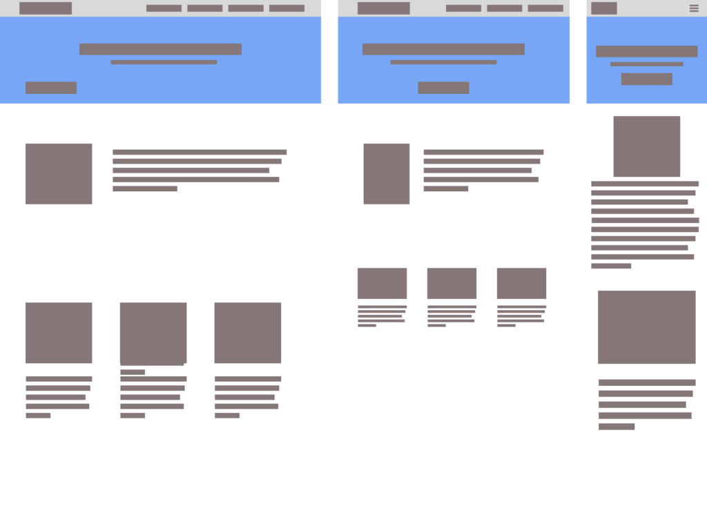
Web Design How to Make Your Website Look Less “Blocky” Julian Miller Creative Director – South County Creative How to Make Your Website Look Less “Blocky” Building a website on a platform like WordPress, Wix, or Shopify makes the process a breeze. You can quickly drag and drop content and get a website up in no time. But one of the drawbacks is a lot of the time the content looks very “blocky”. Almost like you are given a bunch of Lego pieces and asked to make a house with them. Creating a modern, sleek, and visually appealing website on one of these Content Management Systems (CMS) involves several key strategies to avoid that blocky and outdated look that can sometimes plague websites. Basic wireframe layout for a website Step 1: Choose a Contemporary Theme Whatever CMS platform you choose, you will have many options for themes. A theme is basically the colors, fonts, layouts, animations, and general look-and-feel of the webpage. One of the best parts about picking a theme is all you have to do is replace their stock content with your own. Many times you can get away with keeping the same layout and flow. Most popular themes in WordPress There is a drawback however. If you want to add additional content or sections to the page that didn’t come stock with your chosen theme. You will need to add the content understanding the overall flow and style of the website. This is where the blocky nature of homemade websites begins. When adding content to a theme that doesn’t already exist, CMS platforms like WordPress, Wix, Shopify or literally any other drag-and-drop website platforms offer “blocks” to include. These blocks are pre-built and pre-styled components that you just plop in wherever you like. This freedom can impact the design and look forced and many amateur web designers will add background colors, not enough padding or margins between block elements which interrupt the design and begin to feel blocky. Step 2: Choose Your Plugins All web building platforms offer plugins. Depending on which platform you choose you will have a number of free and premium options. Some free options may entice you to purchase their “pro” version offering which opens up many new options for your website. Using WordPress as an examples, page builders like Elementor, Beaver Builder, and Divi are very popular plugins that allow you to create custom layouts with drag-and-drop functionality, giving you more control over the design of your website. These are literally referred to as “Block Builders”! See how they encourage this Blocky behavior!?!? These tools offer a wide range of design elements, such as columns, sliders, and galleries, which can help you create a more dynamic and visually appealing layout. By using a page builder, you can avoid the rigid, blocky appearance that can result from using default WordPress layouts by offering many ways to stylize your additions. Again, the goal is to avoid thinking about each one of these blocks as independent of the overall theme of your website. There are many other types of plugins like ones for security, image optimization, and backups, but the ones we are focused on are block element related. Step 3: Image Selection Another important aspect of avoiding the “blocky look” and that dreaded 90’s dialup website look is by the use of high-quality images and graphics. Visual content plays a crucial role in making a website look professional and engaging. Invest in high-resolution images and consider using stock photo websites like Unsplash, Pexels, or Shutterstock. Additionally, incorporating custom graphics and icons can add a unique touch to your site. Tools like Canva and Adobe Spark can help you create visually appealing graphics that align with your brand’s aesthetic. We go into a deep dive to this topic of image selection and image optimization in this article How to Optimize your Images. Step 4: Typography Also known as fonts, typography also plays a significant role in the overall look and feel of your website. Choosing modern, clean fonts can make a big difference in how your content is perceived. Google Fonts offers a wide selection of free fonts that you can easily integrate into your website. Some of the more popular fonts used today are: Inter, DM Sans, Roboto, Raleway, Open Sans, and Poppins. Google Fonts Stick to a limited number of fonts to maintain a cohesive look, and ensure that your text is easy to read by using appropriate font sizes and line spacing. Consistent and thoughtful typography can greatly enhance the visual appeal of your website. Best practice is to pick a font style for your headers (H1-H6) or display text and another one for the body, accent, and sub header text. Websites like Pair and Compare, Font Fabric and Font Comparer allow you to place two or more fonts next to each other and see how they look. Sometimes you can find the perfect match this way. Step 5: Whitespace One of my favorite topics is how to incorporate whitespace (or negative space) effectively. This is in my opinion one of the best key strategies to utilize to avoid a cluttered and outdated appearance. Whitespace refers to the empty areas between design element blocks. It helps to create a balanced and organized layout, making your content more readable and visually appealing. It is very important to give your design elements room to breathe. This minimalist approach can make your website look more modern and sleek by simply adding a bit more margin to the top and bottom of your block section Adding whitespace to the the left or right of your block containers can help by creating an offset look. Be bold, but also cautious. If the flow allows it then great! Otherwise you may need to find multiple parts of your website to incorporate this look. Otherwise it will feel totally out of place. Step 6: Responsive Web Design – Desktop-First or Mobile-First Approach Desktop First desgin: Design for users
How To Optimize Images for Websites

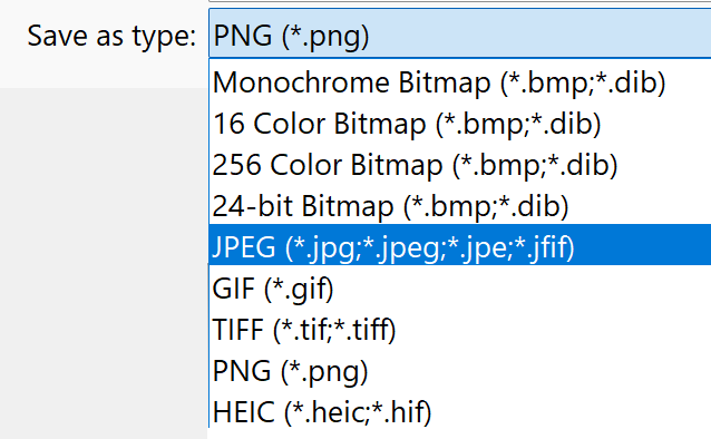
Web Optimization How To Optimize Images for Websites Julian Miller Creative Director – South County Creative Best Way to Add and Optimize Images to Your Website. One of the most important and challenging parts in designing a webpage is how to select and optimize images. Yes, all content is important, but in this case; less is more. What if you don’t have a team of photographers and graphic designers at your fingertips? Then you are left to explore the internet and figure it out on your own. And deep down you know it’s important too. Selecting the right images leads to better visual appearance and engagement on your website. It also leads in conveying information more effectively and help strengthen or build your brand You may be confronted with several questions: What file type should I use for images? .jpg, .svg, .png, .jpeg(didn’t I just mention that?), and that weird one that iPhone use for some reason? I uploaded my photo but it’s taking forever to load on my page? Why is my image blurry or stretched (or both!!)? Where can I find a photo that isn’t copyrighted? If you have struggled with any of those questions, then I feel your pain. I’ve been there. This article will hopefully help answer some of these questions and more. JPG vs JPEG vs PNG vs SVG. I’m so confused… Developing a striking and relevant website requires many things, but none more important than images. There are many formats for websites but the most important three are JPEG, SVG and PNG. As a web developer I use these formats for the following purposes: JPEG (or JPG): for images SVG: for icons, shapes, or dividers PNG: for logos, icons, and anything requiring transparency JPEG vs JPG what is the difference? For most of us, they are essentially the same thing. If someone says JPG (pronounced Jay Pee Gee) or JPEG (pronounced Jay Peg) they are essentially saying the same thing. I’m sure there will be some in the comment section pointing out why this is SOOO wrong, but there has never been a single experience in my time as a web developer where one was preferred over the other. They are the same. Period. Personally, I like JPEG because it is more fun to say “Jay Peg”. Almost sounds like a bird. Why would I use a JPEG? For almost every image I use online I immediately default to JPEG. This is perfect for pixels and clarity and can be optimized to reduce size while not reducing image quality. Where Can I Find JPEG images for my Website? I love using stock images for web resources. Especially when I need something standard almost as a place holder. For this I use Unsplash Personally, I use Unsplash for almost all my projects. Especially if you need some placeholder images or just something to help set the vibe. Unsplash really is the gold standard. But wait! Theres more! If you are looking for other examples of online image galleries, you can try one of these Pexels: claims to be the best free stock photos, royalty free images & videos shared by creators online. It has a similar experience to Unsplash and has over a million high-quality images, and you can download them without signing up. Pexels also provides browser extensions and plugins for easy access. Pixabay: makes a similar claim to Pexels as “Stunning royalty-free images & royalty-free stock”. They offer over 4.4 million+ high quality stock images, videos and music shared by our talented community. Like Unsplash, it allows direct downloads without registration. Openverse: is an open-source alternative to Unsplash and part of the WordPress Project. It has “more than 700 million creative works” and offers the Creative Commons Licence for all its images which means you can confidently post their content on your website without fear of lawyers *(read the fine print of course). Wikimedia Commons: If you are familiar with Wikipedia, then this will feel very familiar. It offeres a vast repository of freely usable media files, including images, audio, and video. It’s a valuable resource for educational and creative projects. Freepik: While Freepik offers more than just photos (including vectors and illustrations), it’s a great source for visual content. It also offers templates and paid content. Im not very familiar with it, but its another resource that might be helpful. Zoinks! Those Images Are Really Large! Are They Too Big For My Website?! Yes and yes. Next question? Jk. Yes many of the images you download from Unsplash or one of their competitors are by design massive images. They are intentionally large because they are meant to highlight the photographer or designers image as the absolute highest quality. Some of these images can be 20 or more megabytes (mb). While beautiful, they are horrible for SEO and your website will crawl like it’s the 1990’s and you are on that 65k dialup modem (remember the noises?). You will ABSOLUTELY NEED TO OPTIMIZE IMAGES. Yes, I am yelling and it’s for your own good. Setting out to optimize images sounds complicated but it is not. There are many online resources that are incredibly easy to use and even offer options to tweak the quality. A good rule to live by when optimizing images is keep all image sizes as small as possible body images around 200-350 kilobytes (KB) Header/Hero Images between 700-900 KB Depending on heigh of image and if it goes full screen left to right. * For reference, 1000 kb is equivalent to 1 mb. The problem you will need to accept is image quality. The image quality will go down but there are a few tricks you can use to avoid this: Choose images that do not need to convey a lot of detail. While beach sunsets are beautiful you don’t necessarily need to see every H2O molecule in the waves. Add an overlay: you can layer a color over your photo and set the opacity to go from 0 to